This week I thought I’d highlight something interesting that I noticed on Duolingo’s homepage—something that I’ve actually never seen before.
The vast majority of companies treat their homepage like a static resource. That means that no matter who you are and no matter which stage of the user lifecycle you’re in, you’ll see the exact same page.
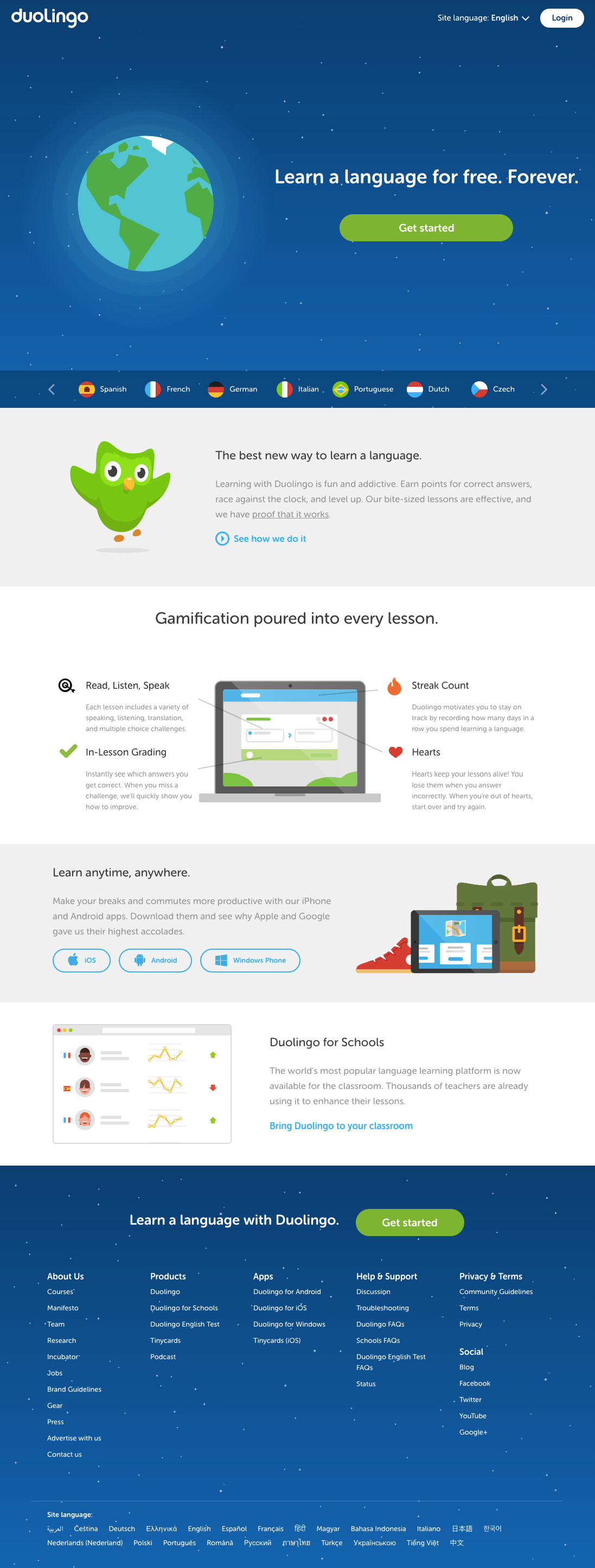
Duolingo does something different. Check it out: Here’s what their homepage looks like when you go there for the first time:
Default Homepage

This is pretty much what you’d expect to see from a companies home page. Right?
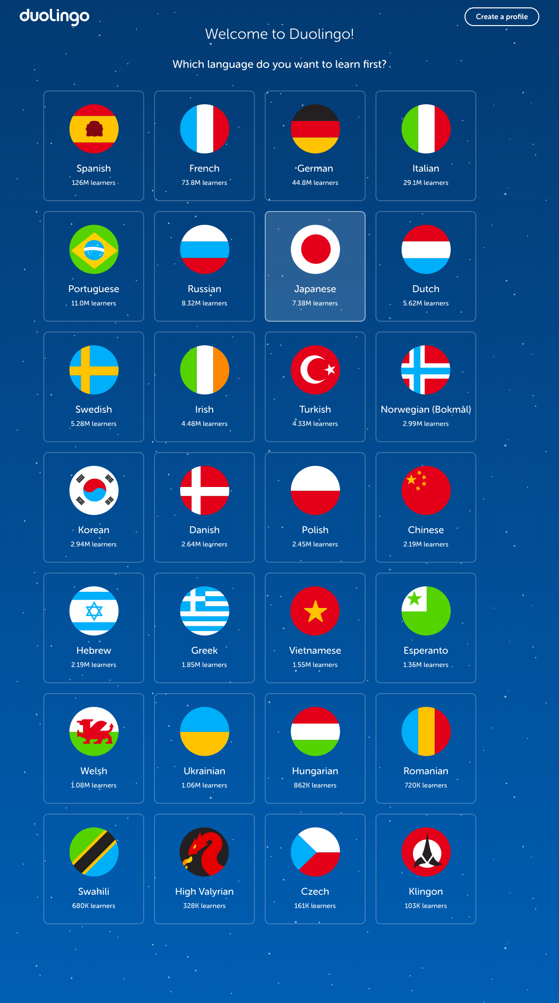
But check out what happens to the homepage once you start any one of their many courses—it doesn’t matter if you just answer one question — you don’t even have to create an account — when you go back to the homepage, you’ll now see:
Homepage immediately after engagement

This approach is extremely interesting to me. It’s super clever. At this point they’re making the assumption that you already know what Duolingo is. Because you’ve already shown intent to learn, they’ve stripped away all of the marketing fluff. At this point, the only thing they allow you to do is take action. You can either create a profile, or start one of their many courses. That’s it.
Isn’t that awesome?
But they don’t stop there…
Check out what happens to the homepage if you come back a day or so later:
Homepage after engagement + more time

Without ever creating an account, they’ve customized the entire onboarding experience for you—making it look like you already have an account.
This is brilliant. I’d love to see more apps utilizing this technique.
What do you think?
How could you customize the look of your SaaS app’s homepage based on initial user engagement?
If you give it a try, I’d love to see what you come up with.
Leave a comment